Designed AEM component
My role: UI, visual design
Project duration: 2 months
Collaboration: Project manager, 8 producer, tester
Platform: Web, responsive design
Tools: Figma, Photoshop
Overview:
Our company transitioned from using the ET (ExactTarget) CMS to the AEM (Adobe Experience Manager) platform. After the migration, I identified an issue with image scrolling on the banner component. The challenge was that the launch of the new iPhone was just two months away, and Apple’s design approval was needed.
Finding current issues:
After conducting research, we found that the main challenge was scaling image assets, especially for desktop views, where it isn't easy to control and balance with the CTA button and text.

The image below illustrates that the banner component scaled down iPhone images. I added a magenta colour grid, but this component disregards it, making it difficult to determine the placement of the logo, text, and CTA button.

My recommendation:
I coordinated a meeting with key stakeholders - the product owner, senior developer, and designer - to propose an update to the banner component. Specifically, I recommended a fixed height, background image, foreground image, and a grid layout. This ensured that the asset was both visually appealing and balanced in its placement.
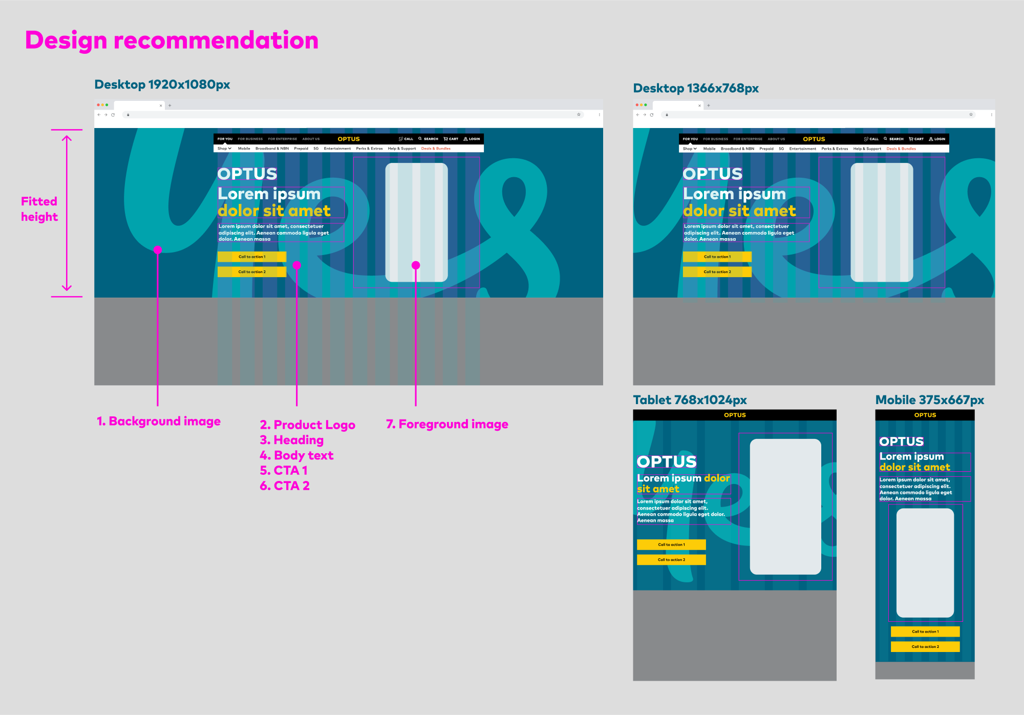
Final design:
The developer team implemented my suggestions and grid layout. They applied as mesh guides and each asset was able to pine to the point. As a result, the iPhone launch was successful with no major issues reported by Apple.
