
Case Study - Landing page banner component optimisation
Optimized banner functionality & pixel-perfect execution to meet Apple's standards, breaking records to build a component in just two months.
The starting point
I was nominated as the lead designer for the launch of the latest Apple iPhone. The company decided to use a new CMS template for the launch, which raised some concerns for me. The banner component that had been in use for several months had some issues with auto-scaling images and missing settings, which could impact the iPhone launch.
To create an Apple product banner, we must strictly follow the marketing guidelines. If the banner design does not comply with the guidelines, we will not receive approval from Apple.
I conducted research and analysed the current issues to identify any potential problems with the landing page's banner content and functionality.
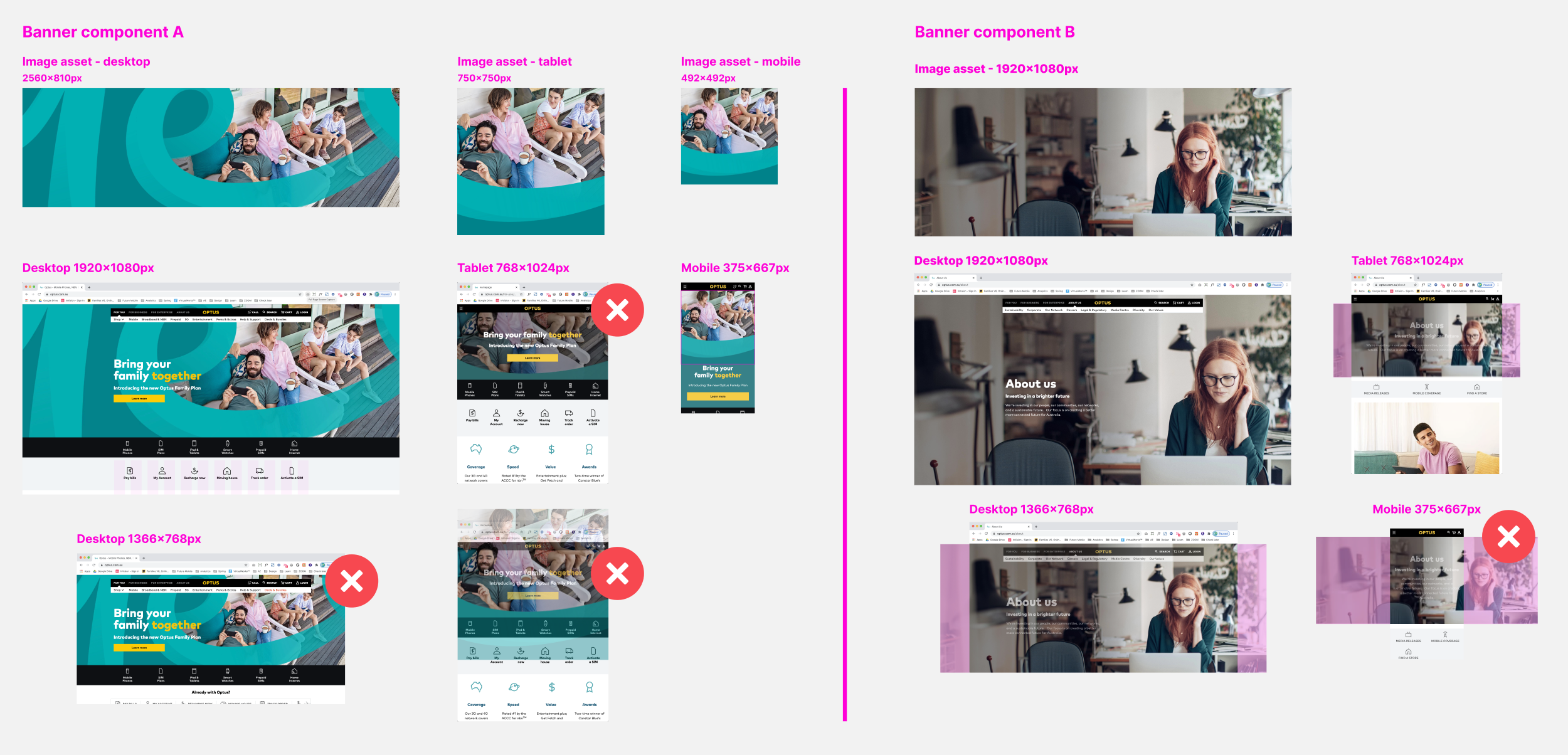
Current banner setting and issues
Responsive background image changing negative space and moving focal point
Responsive background image creates an issue of accessibility colour contrast between the heading copy and image
Using a grid system to layout text in the design process, but the current banner template doesn’t apply it
Image size template targeting large desktop screen size and it creates image file size huge and slow page loading speed
When optimising background images to minimise file size it creates poor image quality.
Conforming to Apple marketing guidelines
Disable responsive background to stop scaling and moving image
Need to use foreground and background images and not scale them
Need to follow a grid system to align spacing and positioning
Need to place 2 CTA buttons, not 1
The component needs to be finalised within 2 months, which was a challenge as change requests usually take 6 months.

I have researched Apple iPhone marketing guidelines from the past 3 years to design landing page banners for desktop, tablet, and mobile screens. After that, I shared these designs with key stakeholders to get feedback and improve the design. Following that, I finalised the recommended template within a week and conducted a meeting with the key stakeholders to propose the banner update. Finally, I received approval from them. However, we only have 1 month and 3 weeks to build and test the final product.

Finalised banner component
The development team has implemented my design and recommended using mesh guides. This allowed each asset to align precisely to the desired point. Each breakpoint can be assigned an asset location, ensuring a pixel-perfect design.
The new template was finalised two weeks before the iPhone launch.
What did I learn?
As a result, the iPhone launch was successful, and no issues were reported by Apple.
Open to feedback and flexible to work. I didn’t think about the mesh grid setting, but it has been working well since creation
My concern was developing time, so I followed up every day and made sure nothing blocking it and calculated to meet a deadline
I received recognition from key stakeholders. “The “best in class” feedback from Apple is a testament to your pixel-perfect designs, immense skill and commitment to quality. As part of this, he proactively identified a risk in our componentry, embracing TOFU (Take Ownership, Follow Up) to drive an outcome by designing and working with multiple stakeholders across the tribe to ensure we delivered the new banner component in time.”